Friday, February 17, 2012

Top Five Basic Tips to make your Photograph Extra-Ordinary from a very casual & ordinary shot

Today one of my friend came to me and asked about some basic tips to improve his casual shots from last trip to Europe. During the process, I told him very basic things which helped him making Photographs better. I thought of sharing the top five edits one should try to make an ordinary photograph extra-ordinary. Let's check out..Let's take a casual shot and go step by step to understand the sequence of Edits I would recommend 1. Open a Photograph in Adobe Photoshop Elements through File Menu.2. Select Crop tool on Left Tool-bar and remove unwanted areas. Also try to fit your main subject as per rule of thirds, if possible. If you don't know about it, forget and we shall share more details about it.3. Now do to Adjustment Layer options below Layer Panel and select Levels. Levels Adjustment Layer makes a lot of difference to a Photograph. See the screenshot below to understand what you need to select and click.4. Notice the highlighted part below, which should also be visible on your workspace of Adobe Photoshop Elements5. Moved extreme sliders towards inside until you feel that it's making photograph too dark or too light.  When done, select the middle pointer and play with it. Extreme pointers are for handling Darker Pixels and Brighter pixels of a Photograph. Middle slider works on Mid-Tones. Levels help in making elements of the photograph stronger. At times, it can be a big blunder is not used appropriately6. Notice the changes we did to this Photograph and amount of movement in each slider. You may choose to stick to a limit which will also give you decent results unless photograph is not clicked in extreme light conditions - Dark area or very bright area.7. Now check out the image below to know about next adjustment we are going to discuss. Next is to select Brightness/Contrast Adjustment Layer.8. Play with Brightness and Contrast sliders. Both of these sliders need to b used in sync as right mix of Brightness and Contrast is important. For example, if you have photographs with darker shades, you may want to increase the Brightness by keeping contrast low or Vice-vers 9. Hope so far you have been liking the change in above photograph and the photograph you are trying in your Photoshop Elements. If you are not trying it., believe me it's not going to help anyway. So if not started yet, open your workspace and follow from top. If not completely, you will enjoy the process and the sequence shared here. With practice you can do miracles with these editing steps. It's all about understanding the compositions with respect to lighting, contrast, colors and placement10. At times, Editing tend to change the colors in a photograph. In above photograph I notice pale colored tint and want to remove that. At least want to keep the hen in white. So let's select Hue/Saturation Adjustment Layer.11. In above photograph Saturation of Yellow is decreased so that it looks white and more real. At the same time Hue of red is changed in conjunction with increasing the Saturation 12. We have applied four adjustments to original Photograph so far - Crop, Levels, Brightness/Contrast, Hue/Saturation. Now we want to just add a frame to the photograph. Few people don't like Frames so can simply avoid the last step and we promise to share more tips around making photograph beautiful with minimal efforts.13. If want to add frame, go to Image Menu and Resize Canvas Size.14. Below shown dialog will be shown. Choose the border size accordingly with color of your choice and click OK.You are done with this and hope you understood the basic concepts around these 5 editing controls which is more important than your final result. It's completely OK, if you haven't got right result in one go. Now you can simply save the results as PSD and later adjustment layers can be tweaked to make them better.

Today one of my friend came to me and asked about some basic tips to improve his casual shots from last trip to Europe. During the process, I told him very basic things which helped him making Photographs better. I thought of sharing the top five edits one should try to make an ordinary photograph extra-ordinary. Let's check out...


Let's take a casual shot and go step by step to understand the sequence of Edits I would recommend !

1. Open a Photograph in Adobe Photoshop Elements through File Menu.

Today one of my friend came to me and asked about some basic tips to improve his casual shots from last trip to Europe. During the process, I told him very basic things which helped him making Photographs better. I thought of sharing the top five edits one should try to make an ordinary photograph extra-ordinary. Let's check out..Let's take a casual shot and go step by step to understand the sequence of Edits I would recommend 1. Open a Photograph in Adobe Photoshop Elements through File Menu.2. Select Crop tool on Left Tool-bar and remove unwanted areas. Also try to fit your main subject as per rule of thirds, if possible. If you don't know about it, forget and we shall share more details about it.3. Now do to Adjustment Layer options below Layer Panel and select Levels. Levels Adjustment Layer makes a lot of difference to a Photograph. See the screenshot below to understand what you need to select and click.4. Notice the highlighted part below, which should also be visible on your workspace of Adobe Photoshop Elements5. Moved extreme sliders towards inside until you feel that it's making photograph too dark or too light.  When done, select the middle pointer and play with it. Extreme pointers are for handling Darker Pixels and Brighter pixels of a Photograph. Middle slider works on Mid-Tones. Levels help in making elements of the photograph stronger. At times, it can be a big blunder is not used appropriately6. Notice the changes we did to this Photograph and amount of movement in each slider. You may choose to stick to a limit which will also give you decent results unless photograph is not clicked in extreme light conditions - Dark area or very bright area.7. Now check out the image below to know about next adjustment we are going to discuss. Next is to select Brightness/Contrast Adjustment Layer.8. Play with Brightness and Contrast sliders. Both of these sliders need to b used in sync as right mix of Brightness and Contrast is important. For example, if you have photographs with darker shades, you may want to increase the Brightness by keeping contrast low or Vice-vers 9. Hope so far you have been liking the change in above photograph and the photograph you are trying in your Photoshop Elements. If you are not trying it., believe me it's not going to help anyway. So if not started yet, open your workspace and follow from top. If not completely, you will enjoy the process and the sequence shared here. With practice you can do miracles with these editing steps. It's all about understanding the compositions with respect to lighting, contrast, colors and placement10. At times, Editing tend to change the colors in a photograph. In above photograph I notice pale colored tint and want to remove that. At least want to keep the hen in white. So let's select Hue/Saturation Adjustment Layer.11. In above photograph Saturation of Yellow is decreased so that it looks white and more real. At the same time Hue of red is changed in conjunction with increasing the Saturation 12. We have applied four adjustments to original Photograph so far - Crop, Levels, Brightness/Contrast, Hue/Saturation. Now we want to just add a frame to the photograph. Few people don't like Frames so can simply avoid the last step and we promise to share more tips around making photograph beautiful with minimal efforts.13. If want to add frame, go to Image Menu and Resize Canvas Size.14. Below shown dialog will be shown. Choose the border size accordingly with color of your choice and click OK.You are done with this and hope you understood the basic concepts around these 5 editing controls which is more important than your final result. It's completely OK, if you haven't got right result in one go. Now you can simply save the results as PSD and later adjustment layers can be tweaked to make them better.

2. Select Crop tool on Left Tool-bar and remove unwanted areas. Also try to fit your main subject as per rule of thirds, if possible. If you don't know about it, forget and we shall share more details about it.
Today one of my friend came to me and asked about some basic tips to improve his casual shots from last trip to Europe. During the process, I told him very basic things which helped him making Photographs better. I thought of sharing the top five edits one should try to make an ordinary photograph extra-ordinary. Let's check out..Let's take a casual shot and go step by step to understand the sequence of Edits I would recommend 1. Open a Photograph in Adobe Photoshop Elements through File Menu.2. Select Crop tool on Left Tool-bar and remove unwanted areas. Also try to fit your main subject as per rule of thirds, if possible. If you don't know about it, forget and we shall share more details about it.3. Now do to Adjustment Layer options below Layer Panel and select Levels. Levels Adjustment Layer makes a lot of difference to a Photograph. See the screenshot below to understand what you need to select and click.4. Notice the highlighted part below, which should also be visible on your workspace of Adobe Photoshop Elements5. Moved extreme sliders towards inside until you feel that it's making photograph too dark or too light.  When done, select the middle pointer and play with it. Extreme pointers are for handling Darker Pixels and Brighter pixels of a Photograph. Middle slider works on Mid-Tones. Levels help in making elements of the photograph stronger. At times, it can be a big blunder is not used appropriately6. Notice the changes we did to this Photograph and amount of movement in each slider. You may choose to stick to a limit which will also give you decent results unless photograph is not clicked in extreme light conditions - Dark area or very bright area.7. Now check out the image below to know about next adjustment we are going to discuss. Next is to select Brightness/Contrast Adjustment Layer.8. Play with Brightness and Contrast sliders. Both of these sliders need to b used in sync as right mix of Brightness and Contrast is important. For example, if you have photographs with darker shades, you may want to increase the Brightness by keeping contrast low or Vice-vers 9. Hope so far you have been liking the change in above photograph and the photograph you are trying in your Photoshop Elements. If you are not trying it., believe me it's not going to help anyway. So if not started yet, open your workspace and follow from top. If not completely, you will enjoy the process and the sequence shared here. With practice you can do miracles with these editing steps. It's all about understanding the compositions with respect to lighting, contrast, colors and placement10. At times, Editing tend to change the colors in a photograph. In above photograph I notice pale colored tint and want to remove that. At least want to keep the hen in white. So let's select Hue/Saturation Adjustment Layer.11. In above photograph Saturation of Yellow is decreased so that it looks white and more real. At the same time Hue of red is changed in conjunction with increasing the Saturation 12. We have applied four adjustments to original Photograph so far - Crop, Levels, Brightness/Contrast, Hue/Saturation. Now we want to just add a frame to the photograph. Few people don't like Frames so can simply avoid the last step and we promise to share more tips around making photograph beautiful with minimal efforts.13. If want to add frame, go to Image Menu and Resize Canvas Size.14. Below shown dialog will be shown. Choose the border size accordingly with color of your choice and click OK.You are done with this and hope you understood the basic concepts around these 5 editing controls which is more important than your final result. It's completely OK, if you haven't got right result in one go. Now you can simply save the results as PSD and later adjustment layers can be tweaked to make them better.
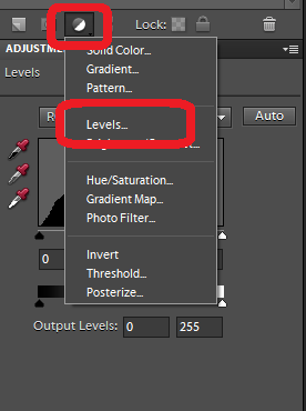
3. Now do to Adjustment Layer options below Layer Panel and select Levels. Levels Adjustment Layer makes a lot of difference to a Photograph. See the screenshot below to understand what you need to select and click.

Today one of my friend came to me and asked about some basic tips to improve his casual shots from last trip to Europe. During the process, I told him very basic things which helped him making Photographs better. I thought of sharing the top five edits one should try to make an ordinary photograph extra-ordinary. Let's check out..Let's take a casual shot and go step by step to understand the sequence of Edits I would recommend 1. Open a Photograph in Adobe Photoshop Elements through File Menu.2. Select Crop tool on Left Tool-bar and remove unwanted areas. Also try to fit your main subject as per rule of thirds, if possible. If you don't know about it, forget and we shall share more details about it.3. Now do to Adjustment Layer options below Layer Panel and select Levels. Levels Adjustment Layer makes a lot of difference to a Photograph. See the screenshot below to understand what you need to select and click.4. Notice the highlighted part below, which should also be visible on your workspace of Adobe Photoshop Elements5. Moved extreme sliders towards inside until you feel that it's making photograph too dark or too light.  When done, select the middle pointer and play with it. Extreme pointers are for handling Darker Pixels and Brighter pixels of a Photograph. Middle slider works on Mid-Tones. Levels help in making elements of the photograph stronger. At times, it can be a big blunder is not used appropriately6. Notice the changes we did to this Photograph and amount of movement in each slider. You may choose to stick to a limit which will also give you decent results unless photograph is not clicked in extreme light conditions - Dark area or very bright area.7. Now check out the image below to know about next adjustment we are going to discuss. Next is to select Brightness/Contrast Adjustment Layer.8. Play with Brightness and Contrast sliders. Both of these sliders need to b used in sync as right mix of Brightness and Contrast is important. For example, if you have photographs with darker shades, you may want to increase the Brightness by keeping contrast low or Vice-vers 9. Hope so far you have been liking the change in above photograph and the photograph you are trying in your Photoshop Elements. If you are not trying it., believe me it's not going to help anyway. So if not started yet, open your workspace and follow from top. If not completely, you will enjoy the process and the sequence shared here. With practice you can do miracles with these editing steps. It's all about understanding the compositions with respect to lighting, contrast, colors and placement10. At times, Editing tend to change the colors in a photograph. In above photograph I notice pale colored tint and want to remove that. At least want to keep the hen in white. So let's select Hue/Saturation Adjustment Layer.11. In above photograph Saturation of Yellow is decreased so that it looks white and more real. At the same time Hue of red is changed in conjunction with increasing the Saturation 12. We have applied four adjustments to original Photograph so far - Crop, Levels, Brightness/Contrast, Hue/Saturation. Now we want to just add a frame to the photograph. Few people don't like Frames so can simply avoid the last step and we promise to share more tips around making photograph beautiful with minimal efforts.13. If want to add frame, go to Image Menu and Resize Canvas Size.14. Below shown dialog will be shown. Choose the border size accordingly with color of your choice and click OK.You are done with this and hope you understood the basic concepts around these 5 editing controls which is more important than your final result. It's completely OK, if you haven't got right result in one go. Now you can simply save the results as PSD and later adjustment layers can be tweaked to make them better.
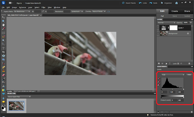
4. Notice the highlighted part below, which should also be visible on your workspace of Adobe Photoshop Elements.

Today one of my friend came to me and asked about some basic tips to improve his casual shots from last trip to Europe. During the process, I told him very basic things which helped him making Photographs better. I thought of sharing the top five edits one should try to make an ordinary photograph extra-ordinary. Let's check out..Let's take a casual shot and go step by step to understand the sequence of Edits I would recommend 1. Open a Photograph in Adobe Photoshop Elements through File Menu.2. Select Crop tool on Left Tool-bar and remove unwanted areas. Also try to fit your main subject as per rule of thirds, if possible. If you don't know about it, forget and we shall share more details about it.3. Now do to Adjustment Layer options below Layer Panel and select Levels. Levels Adjustment Layer makes a lot of difference to a Photograph. See the screenshot below to understand what you need to select and click.4. Notice the highlighted part below, which should also be visible on your workspace of Adobe Photoshop Elements5. Moved extreme sliders towards inside until you feel that it's making photograph too dark or too light.  When done, select the middle pointer and play with it. Extreme pointers are for handling Darker Pixels and Brighter pixels of a Photograph. Middle slider works on Mid-Tones. Levels help in making elements of the photograph stronger. At times, it can be a big blunder is not used appropriately6. Notice the changes we did to this Photograph and amount of movement in each slider. You may choose to stick to a limit which will also give you decent results unless photograph is not clicked in extreme light conditions - Dark area or very bright area.7. Now check out the image below to know about next adjustment we are going to discuss. Next is to select Brightness/Contrast Adjustment Layer.8. Play with Brightness and Contrast sliders. Both of these sliders need to b used in sync as right mix of Brightness and Contrast is important. For example, if you have photographs with darker shades, you may want to increase the Brightness by keeping contrast low or Vice-vers 9. Hope so far you have been liking the change in above photograph and the photograph you are trying in your Photoshop Elements. If you are not trying it., believe me it's not going to help anyway. So if not started yet, open your workspace and follow from top. If not completely, you will enjoy the process and the sequence shared here. With practice you can do miracles with these editing steps. It's all about understanding the compositions with respect to lighting, contrast, colors and placement10. At times, Editing tend to change the colors in a photograph. In above photograph I notice pale colored tint and want to remove that. At least want to keep the hen in white. So let's select Hue/Saturation Adjustment Layer.11. In above photograph Saturation of Yellow is decreased so that it looks white and more real. At the same time Hue of red is changed in conjunction with increasing the Saturation 12. We have applied four adjustments to original Photograph so far - Crop, Levels, Brightness/Contrast, Hue/Saturation. Now we want to just add a frame to the photograph. Few people don't like Frames so can simply avoid the last step and we promise to share more tips around making photograph beautiful with minimal efforts.13. If want to add frame, go to Image Menu and Resize Canvas Size.14. Below shown dialog will be shown. Choose the border size accordingly with color of your choice and click OK.You are done with this and hope you understood the basic concepts around these 5 editing controls which is more important than your final result. It's completely OK, if you haven't got right result in one go. Now you can simply save the results as PSD and later adjustment layers can be tweaked to make them better.
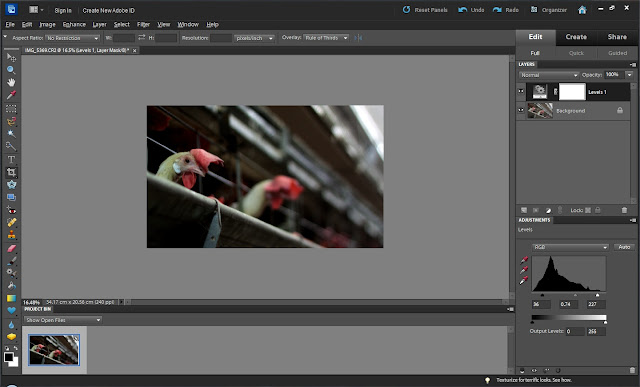
5. Moved extreme sliders towards inside until you feel that it's making photograph too dark or too light.  When done, select the middle pointer and play with it. Extreme pointers are for handling Darker Pixels and Brighter pixels of a Photograph. Middle slider works on Mid-Tones. Levels help in making elements of the photograph stronger. At times, it can be a big blunder is not used appropriately.

Today one of my friend came to me and asked about some basic tips to improve his casual shots from last trip to Europe. During the process, I told him very basic things which helped him making Photographs better. I thought of sharing the top five edits one should try to make an ordinary photograph extra-ordinary. Let's check out..Let's take a casual shot and go step by step to understand the sequence of Edits I would recommend 1. Open a Photograph in Adobe Photoshop Elements through File Menu.2. Select Crop tool on Left Tool-bar and remove unwanted areas. Also try to fit your main subject as per rule of thirds, if possible. If you don't know about it, forget and we shall share more details about it.3. Now do to Adjustment Layer options below Layer Panel and select Levels. Levels Adjustment Layer makes a lot of difference to a Photograph. See the screenshot below to understand what you need to select and click.4. Notice the highlighted part below, which should also be visible on your workspace of Adobe Photoshop Elements5. Moved extreme sliders towards inside until you feel that it's making photograph too dark or too light.  When done, select the middle pointer and play with it. Extreme pointers are for handling Darker Pixels and Brighter pixels of a Photograph. Middle slider works on Mid-Tones. Levels help in making elements of the photograph stronger. At times, it can be a big blunder is not used appropriately6. Notice the changes we did to this Photograph and amount of movement in each slider. You may choose to stick to a limit which will also give you decent results unless photograph is not clicked in extreme light conditions - Dark area or very bright area.7. Now check out the image below to know about next adjustment we are going to discuss. Next is to select Brightness/Contrast Adjustment Layer.8. Play with Brightness and Contrast sliders. Both of these sliders need to b used in sync as right mix of Brightness and Contrast is important. For example, if you have photographs with darker shades, you may want to increase the Brightness by keeping contrast low or Vice-vers 9. Hope so far you have been liking the change in above photograph and the photograph you are trying in your Photoshop Elements. If you are not trying it., believe me it's not going to help anyway. So if not started yet, open your workspace and follow from top. If not completely, you will enjoy the process and the sequence shared here. With practice you can do miracles with these editing steps. It's all about understanding the compositions with respect to lighting, contrast, colors and placement10. At times, Editing tend to change the colors in a photograph. In above photograph I notice pale colored tint and want to remove that. At least want to keep the hen in white. So let's select Hue/Saturation Adjustment Layer.11. In above photograph Saturation of Yellow is decreased so that it looks white and more real. At the same time Hue of red is changed in conjunction with increasing the Saturation 12. We have applied four adjustments to original Photograph so far - Crop, Levels, Brightness/Contrast, Hue/Saturation. Now we want to just add a frame to the photograph. Few people don't like Frames so can simply avoid the last step and we promise to share more tips around making photograph beautiful with minimal efforts.13. If want to add frame, go to Image Menu and Resize Canvas Size.14. Below shown dialog will be shown. Choose the border size accordingly with color of your choice and click OK.You are done with this and hope you understood the basic concepts around these 5 editing controls which is more important than your final result. It's completely OK, if you haven't got right result in one go. Now you can simply save the results as PSD and later adjustment layers can be tweaked to make them better.

6. Notice the changes we did to this Photograph and amount of movement in each slider. You may choose to stick to a limit which will also give you decent results unless photograph is not clicked in extreme light conditions - Dark area or very bright area.

7. Now check out the image below to know about next adjustment we are going to discuss. Next is to select Brightness/Contrast Adjustment Layer.

Today one of my friend came to me and asked about some basic tips to improve his casual shots from last trip to Europe. During the process, I told him very basic things which helped him making Photographs better. I thought of sharing the top five edits one should try to make an ordinary photograph extra-ordinary. Let's check out..Let's take a casual shot and go step by step to understand the sequence of Edits I would recommend 1. Open a Photograph in Adobe Photoshop Elements through File Menu.2. Select Crop tool on Left Tool-bar and remove unwanted areas. Also try to fit your main subject as per rule of thirds, if possible. If you don't know about it, forget and we shall share more details about it.3. Now do to Adjustment Layer options below Layer Panel and select Levels. Levels Adjustment Layer makes a lot of difference to a Photograph. See the screenshot below to understand what you need to select and click.4. Notice the highlighted part below, which should also be visible on your workspace of Adobe Photoshop Elements5. Moved extreme sliders towards inside until you feel that it's making photograph too dark or too light.  When done, select the middle pointer and play with it. Extreme pointers are for handling Darker Pixels and Brighter pixels of a Photograph. Middle slider works on Mid-Tones. Levels help in making elements of the photograph stronger. At times, it can be a big blunder is not used appropriately6. Notice the changes we did to this Photograph and amount of movement in each slider. You may choose to stick to a limit which will also give you decent results unless photograph is not clicked in extreme light conditions - Dark area or very bright area.7. Now check out the image below to know about next adjustment we are going to discuss. Next is to select Brightness/Contrast Adjustment Layer.8. Play with Brightness and Contrast sliders. Both of these sliders need to b used in sync as right mix of Brightness and Contrast is important. For example, if you have photographs with darker shades, you may want to increase the Brightness by keeping contrast low or Vice-vers 9. Hope so far you have been liking the change in above photograph and the photograph you are trying in your Photoshop Elements. If you are not trying it., believe me it's not going to help anyway. So if not started yet, open your workspace and follow from top. If not completely, you will enjoy the process and the sequence shared here. With practice you can do miracles with these editing steps. It's all about understanding the compositions with respect to lighting, contrast, colors and placement10. At times, Editing tend to change the colors in a photograph. In above photograph I notice pale colored tint and want to remove that. At least want to keep the hen in white. So let's select Hue/Saturation Adjustment Layer.11. In above photograph Saturation of Yellow is decreased so that it looks white and more real. At the same time Hue of red is changed in conjunction with increasing the Saturation 12. We have applied four adjustments to original Photograph so far - Crop, Levels, Brightness/Contrast, Hue/Saturation. Now we want to just add a frame to the photograph. Few people don't like Frames so can simply avoid the last step and we promise to share more tips around making photograph beautiful with minimal efforts.13. If want to add frame, go to Image Menu and Resize Canvas Size.14. Below shown dialog will be shown. Choose the border size accordingly with color of your choice and click OK.You are done with this and hope you understood the basic concepts around these 5 editing controls which is more important than your final result. It's completely OK, if you haven't got right result in one go. Now you can simply save the results as PSD and later adjustment layers can be tweaked to make them better.

8. Play with Brightness and Contrast sliders. Both of these sliders need to b used in sync as right mix of Brightness and Contrast is important. For example, if you have photographs with darker shades, you may want to increase the Brightness by keeping contrast low or Vice-versa.

Today one of my friend came to me and asked about some basic tips to improve his casual shots from last trip to Europe. During the process, I told him very basic things which helped him making Photographs better. I thought of sharing the top five edits one should try to make an ordinary photograph extra-ordinary. Let's check out..Let's take a casual shot and go step by step to understand the sequence of Edits I would recommend 1. Open a Photograph in Adobe Photoshop Elements through File Menu.2. Select Crop tool on Left Tool-bar and remove unwanted areas. Also try to fit your main subject as per rule of thirds, if possible. If you don't know about it, forget and we shall share more details about it.3. Now do to Adjustment Layer options below Layer Panel and select Levels. Levels Adjustment Layer makes a lot of difference to a Photograph. See the screenshot below to understand what you need to select and click.4. Notice the highlighted part below, which should also be visible on your workspace of Adobe Photoshop Elements5. Moved extreme sliders towards inside until you feel that it's making photograph too dark or too light.  When done, select the middle pointer and play with it. Extreme pointers are for handling Darker Pixels and Brighter pixels of a Photograph. Middle slider works on Mid-Tones. Levels help in making elements of the photograph stronger. At times, it can be a big blunder is not used appropriately6. Notice the changes we did to this Photograph and amount of movement in each slider. You may choose to stick to a limit which will also give you decent results unless photograph is not clicked in extreme light conditions - Dark area or very bright area.7. Now check out the image below to know about next adjustment we are going to discuss. Next is to select Brightness/Contrast Adjustment Layer.8. Play with Brightness and Contrast sliders. Both of these sliders need to b used in sync as right mix of Brightness and Contrast is important. For example, if you have photographs with darker shades, you may want to increase the Brightness by keeping contrast low or Vice-vers 9. Hope so far you have been liking the change in above photograph and the photograph you are trying in your Photoshop Elements. If you are not trying it., believe me it's not going to help anyway. So if not started yet, open your workspace and follow from top. If not completely, you will enjoy the process and the sequence shared here. With practice you can do miracles with these editing steps. It's all about understanding the compositions with respect to lighting, contrast, colors and placement10. At times, Editing tend to change the colors in a photograph. In above photograph I notice pale colored tint and want to remove that. At least want to keep the hen in white. So let's select Hue/Saturation Adjustment Layer.11. In above photograph Saturation of Yellow is decreased so that it looks white and more real. At the same time Hue of red is changed in conjunction with increasing the Saturation 12. We have applied four adjustments to original Photograph so far - Crop, Levels, Brightness/Contrast, Hue/Saturation. Now we want to just add a frame to the photograph. Few people don't like Frames so can simply avoid the last step and we promise to share more tips around making photograph beautiful with minimal efforts.13. If want to add frame, go to Image Menu and Resize Canvas Size.14. Below shown dialog will be shown. Choose the border size accordingly with color of your choice and click OK.You are done with this and hope you understood the basic concepts around these 5 editing controls which is more important than your final result. It's completely OK, if you haven't got right result in one go. Now you can simply save the results as PSD and later adjustment layers can be tweaked to make them better.
 9. Hope so far you have been liking the change in above photograph and the photograph you are trying in your Photoshop Elements. If you are not trying it., believe me it's not going to help anyway. So if not started yet, open your workspace and follow from top. If not completely, you will enjoy the process and the sequence shared here. With practice you can do miracles with these editing steps. It's all about understanding the compositions with respect to lighting, contrast, colors and placement.

10. At times, Editing tend to change the colors in a photograph. In above photograph I notice pale colored tint and want to remove that. At least want to keep the hen in white. So let's select Hue/Saturation Adjustment Layer.

Today one of my friend came to me and asked about some basic tips to improve his casual shots from last trip to Europe. During the process, I told him very basic things which helped him making Photographs better. I thought of sharing the top five edits one should try to make an ordinary photograph extra-ordinary. Let's check out..Let's take a casual shot and go step by step to understand the sequence of Edits I would recommend 1. Open a Photograph in Adobe Photoshop Elements through File Menu.2. Select Crop tool on Left Tool-bar and remove unwanted areas. Also try to fit your main subject as per rule of thirds, if possible. If you don't know about it, forget and we shall share more details about it.3. Now do to Adjustment Layer options below Layer Panel and select Levels. Levels Adjustment Layer makes a lot of difference to a Photograph. See the screenshot below to understand what you need to select and click.4. Notice the highlighted part below, which should also be visible on your workspace of Adobe Photoshop Elements5. Moved extreme sliders towards inside until you feel that it's making photograph too dark or too light.  When done, select the middle pointer and play with it. Extreme pointers are for handling Darker Pixels and Brighter pixels of a Photograph. Middle slider works on Mid-Tones. Levels help in making elements of the photograph stronger. At times, it can be a big blunder is not used appropriately6. Notice the changes we did to this Photograph and amount of movement in each slider. You may choose to stick to a limit which will also give you decent results unless photograph is not clicked in extreme light conditions - Dark area or very bright area.7. Now check out the image below to know about next adjustment we are going to discuss. Next is to select Brightness/Contrast Adjustment Layer.8. Play with Brightness and Contrast sliders. Both of these sliders need to b used in sync as right mix of Brightness and Contrast is important. For example, if you have photographs with darker shades, you may want to increase the Brightness by keeping contrast low or Vice-vers 9. Hope so far you have been liking the change in above photograph and the photograph you are trying in your Photoshop Elements. If you are not trying it., believe me it's not going to help anyway. So if not started yet, open your workspace and follow from top. If not completely, you will enjoy the process and the sequence shared here. With practice you can do miracles with these editing steps. It's all about understanding the compositions with respect to lighting, contrast, colors and placement10. At times, Editing tend to change the colors in a photograph. In above photograph I notice pale colored tint and want to remove that. At least want to keep the hen in white. So let's select Hue/Saturation Adjustment Layer.11. In above photograph Saturation of Yellow is decreased so that it looks white and more real. At the same time Hue of red is changed in conjunction with increasing the Saturation 12. We have applied four adjustments to original Photograph so far - Crop, Levels, Brightness/Contrast, Hue/Saturation. Now we want to just add a frame to the photograph. Few people don't like Frames so can simply avoid the last step and we promise to share more tips around making photograph beautiful with minimal efforts.13. If want to add frame, go to Image Menu and Resize Canvas Size.14. Below shown dialog will be shown. Choose the border size accordingly with color of your choice and click OK.You are done with this and hope you understood the basic concepts around these 5 editing controls which is more important than your final result. It's completely OK, if you haven't got right result in one go. Now you can simply save the results as PSD and later adjustment layers can be tweaked to make them better.

11. In above photograph Saturation of Yellow is decreased so that it looks white and more real. At the same time Hue of red is changed in conjunction with increasing the Saturation.

Today one of my friend came to me and asked about some basic tips to improve his casual shots from last trip to Europe. During the process, I told him very basic things which helped him making Photographs better. I thought of sharing the top five edits one should try to make an ordinary photograph extra-ordinary. Let's check out..Let's take a casual shot and go step by step to understand the sequence of Edits I would recommend 1. Open a Photograph in Adobe Photoshop Elements through File Menu.2. Select Crop tool on Left Tool-bar and remove unwanted areas. Also try to fit your main subject as per rule of thirds, if possible. If you don't know about it, forget and we shall share more details about it.3. Now do to Adjustment Layer options below Layer Panel and select Levels. Levels Adjustment Layer makes a lot of difference to a Photograph. See the screenshot below to understand what you need to select and click.4. Notice the highlighted part below, which should also be visible on your workspace of Adobe Photoshop Elements5. Moved extreme sliders towards inside until you feel that it's making photograph too dark or too light.  When done, select the middle pointer and play with it. Extreme pointers are for handling Darker Pixels and Brighter pixels of a Photograph. Middle slider works on Mid-Tones. Levels help in making elements of the photograph stronger. At times, it can be a big blunder is not used appropriately6. Notice the changes we did to this Photograph and amount of movement in each slider. You may choose to stick to a limit which will also give you decent results unless photograph is not clicked in extreme light conditions - Dark area or very bright area.7. Now check out the image below to know about next adjustment we are going to discuss. Next is to select Brightness/Contrast Adjustment Layer.8. Play with Brightness and Contrast sliders. Both of these sliders need to b used in sync as right mix of Brightness and Contrast is important. For example, if you have photographs with darker shades, you may want to increase the Brightness by keeping contrast low or Vice-vers 9. Hope so far you have been liking the change in above photograph and the photograph you are trying in your Photoshop Elements. If you are not trying it., believe me it's not going to help anyway. So if not started yet, open your workspace and follow from top. If not completely, you will enjoy the process and the sequence shared here. With practice you can do miracles with these editing steps. It's all about understanding the compositions with respect to lighting, contrast, colors and placement10. At times, Editing tend to change the colors in a photograph. In above photograph I notice pale colored tint and want to remove that. At least want to keep the hen in white. So let's select Hue/Saturation Adjustment Layer.11. In above photograph Saturation of Yellow is decreased so that it looks white and more real. At the same time Hue of red is changed in conjunction with increasing the Saturation 12. We have applied four adjustments to original Photograph so far - Crop, Levels, Brightness/Contrast, Hue/Saturation. Now we want to just add a frame to the photograph. Few people don't like Frames so can simply avoid the last step and we promise to share more tips around making photograph beautiful with minimal efforts.13. If want to add frame, go to Image Menu and Resize Canvas Size.14. Below shown dialog will be shown. Choose the border size accordingly with color of your choice and click OK.You are done with this and hope you understood the basic concepts around these 5 editing controls which is more important than your final result. It's completely OK, if you haven't got right result in one go. Now you can simply save the results as PSD and later adjustment layers can be tweaked to make them better.

12. We have applied four adjustments to original Photograph so far - Crop, Levels, Brightness/Contrast, Hue/Saturation. Now we want to just add a frame to the photograph. Few people don't like Frames so can simply avoid the last step and we promise to share more tips around making photograph beautiful with minimal efforts.

13. If want to add frame, go to Image Menu and Resize Canvas Size.

Today one of my friend came to me and asked about some basic tips to improve his casual shots from last trip to Europe. During the process, I told him very basic things which helped him making Photographs better. I thought of sharing the top five edits one should try to make an ordinary photograph extra-ordinary. Let's check out..Let's take a casual shot and go step by step to understand the sequence of Edits I would recommend 1. Open a Photograph in Adobe Photoshop Elements through File Menu.2. Select Crop tool on Left Tool-bar and remove unwanted areas. Also try to fit your main subject as per rule of thirds, if possible. If you don't know about it, forget and we shall share more details about it.3. Now do to Adjustment Layer options below Layer Panel and select Levels. Levels Adjustment Layer makes a lot of difference to a Photograph. See the screenshot below to understand what you need to select and click.4. Notice the highlighted part below, which should also be visible on your workspace of Adobe Photoshop Elements5. Moved extreme sliders towards inside until you feel that it's making photograph too dark or too light.  When done, select the middle pointer and play with it. Extreme pointers are for handling Darker Pixels and Brighter pixels of a Photograph. Middle slider works on Mid-Tones. Levels help in making elements of the photograph stronger. At times, it can be a big blunder is not used appropriately6. Notice the changes we did to this Photograph and amount of movement in each slider. You may choose to stick to a limit which will also give you decent results unless photograph is not clicked in extreme light conditions - Dark area or very bright area.7. Now check out the image below to know about next adjustment we are going to discuss. Next is to select Brightness/Contrast Adjustment Layer.8. Play with Brightness and Contrast sliders. Both of these sliders need to b used in sync as right mix of Brightness and Contrast is important. For example, if you have photographs with darker shades, you may want to increase the Brightness by keeping contrast low or Vice-vers 9. Hope so far you have been liking the change in above photograph and the photograph you are trying in your Photoshop Elements. If you are not trying it., believe me it's not going to help anyway. So if not started yet, open your workspace and follow from top. If not completely, you will enjoy the process and the sequence shared here. With practice you can do miracles with these editing steps. It's all about understanding the compositions with respect to lighting, contrast, colors and placement10. At times, Editing tend to change the colors in a photograph. In above photograph I notice pale colored tint and want to remove that. At least want to keep the hen in white. So let's select Hue/Saturation Adjustment Layer.11. In above photograph Saturation of Yellow is decreased so that it looks white and more real. At the same time Hue of red is changed in conjunction with increasing the Saturation 12. We have applied four adjustments to original Photograph so far - Crop, Levels, Brightness/Contrast, Hue/Saturation. Now we want to just add a frame to the photograph. Few people don't like Frames so can simply avoid the last step and we promise to share more tips around making photograph beautiful with minimal efforts.13. If want to add frame, go to Image Menu and Resize Canvas Size.14. Below shown dialog will be shown. Choose the border size accordingly with color of your choice and click OK.You are done with this and hope you understood the basic concepts around these 5 editing controls which is more important than your final result. It's completely OK, if you haven't got right result in one go. Now you can simply save the results as PSD and later adjustment layers can be tweaked to make them better.
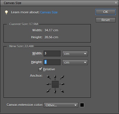
14. Below shown dialog will be shown. Choose the border size accordingly with color of your choice and click OK.

Today one of my friend came to me and asked about some basic tips to improve his casual shots from last trip to Europe. During the process, I told him very basic things which helped him making Photographs better. I thought of sharing the top five edits one should try to make an ordinary photograph extra-ordinary. Let's check out..Let's take a casual shot and go step by step to understand the sequence of Edits I would recommend 1. Open a Photograph in Adobe Photoshop Elements through File Menu.2. Select Crop tool on Left Tool-bar and remove unwanted areas. Also try to fit your main subject as per rule of thirds, if possible. If you don't know about it, forget and we shall share more details about it.3. Now do to Adjustment Layer options below Layer Panel and select Levels. Levels Adjustment Layer makes a lot of difference to a Photograph. See the screenshot below to understand what you need to select and click.4. Notice the highlighted part below, which should also be visible on your workspace of Adobe Photoshop Elements5. Moved extreme sliders towards inside until you feel that it's making photograph too dark or too light.  When done, select the middle pointer and play with it. Extreme pointers are for handling Darker Pixels and Brighter pixels of a Photograph. Middle slider works on Mid-Tones. Levels help in making elements of the photograph stronger. At times, it can be a big blunder is not used appropriately6. Notice the changes we did to this Photograph and amount of movement in each slider. You may choose to stick to a limit which will also give you decent results unless photograph is not clicked in extreme light conditions - Dark area or very bright area.7. Now check out the image below to know about next adjustment we are going to discuss. Next is to select Brightness/Contrast Adjustment Layer.8. Play with Brightness and Contrast sliders. Both of these sliders need to b used in sync as right mix of Brightness and Contrast is important. For example, if you have photographs with darker shades, you may want to increase the Brightness by keeping contrast low or Vice-vers 9. Hope so far you have been liking the change in above photograph and the photograph you are trying in your Photoshop Elements. If you are not trying it., believe me it's not going to help anyway. So if not started yet, open your workspace and follow from top. If not completely, you will enjoy the process and the sequence shared here. With practice you can do miracles with these editing steps. It's all about understanding the compositions with respect to lighting, contrast, colors and placement10. At times, Editing tend to change the colors in a photograph. In above photograph I notice pale colored tint and want to remove that. At least want to keep the hen in white. So let's select Hue/Saturation Adjustment Layer.11. In above photograph Saturation of Yellow is decreased so that it looks white and more real. At the same time Hue of red is changed in conjunction with increasing the Saturation 12. We have applied four adjustments to original Photograph so far - Crop, Levels, Brightness/Contrast, Hue/Saturation. Now we want to just add a frame to the photograph. Few people don't like Frames so can simply avoid the last step and we promise to share more tips around making photograph beautiful with minimal efforts.13. If want to add frame, go to Image Menu and Resize Canvas Size.14. Below shown dialog will be shown. Choose the border size accordingly with color of your choice and click OK.You are done with this and hope you understood the basic concepts around these 5 editing controls which is more important than your final result. It's completely OK, if you haven't got right result in one go. Now you can simply save the results as PSD and later adjustment layers can be tweaked to make them better.

You are done with this and hope you understood the basic concepts around these 5 editing controls which is more important than your final result. It's completely OK, if you haven't got right result in one go. Now you can simply save the results as PSD and later adjustment layers can be tweaked to make them better.

No comments:

Post a Comment

Search This Blog