Making things easy and providing more convenient access to different things is probably, one of the main idea of 11th version apart from some cool features in it. Here we are going to give you some top level glimpses about the changes in main interface of Elements Organizer. And next post would run you through the similar stuff in Editor. Let's check out these screenshots and understand the kind of changes we have in Adobe Photoshop Elements 11.
This is how Elements Organizer 11 looks like Quite clean, more options in one screen and friendlier. Now Organizer has tried to make the whole organizing system more convenient with further fragmentation of woorkflows in terms of separate rooms. It's very well like our houses, where different types of rooms are used for different purposes and aligned well with the architecture. Also all details are kept in mind like - what all should be part of a particular room, which set of rooms are more related etc. Anyways, Elements Organizer 11 has four types of main rooms called - MEDIA, PEOPLE, PLACES, EVENTS. Here we are not going to discuss these in details but names are quite intuitive to make you some solid guesses around the same.
In new Organizer of Adobe Photoshop Elements 11, now Folders are shown in two mode and works far better than earlier versions. by default you see all the folders from which you have imported the files into organizer and we can also switch to hierarchical mode which is what we used to see in old versions.
Media Room shares almost all the functionality what we used to have in old Organizer (Image-well)...
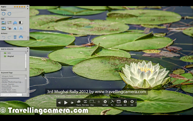
Full Screen View...
Top bar of Elements Organizer 11 to switch between one room to another.
People room is more about organizing the photographs according to the face information available.
This was more of a quick glimpse through screenshots and would come with detailed information about new offerings in Adobe Photoshop Elements 11.


No comments:
Post a Comment